BLZ Padel was created to bring a bold, modern energy to one of the fastest-growing sports in the world. The challenge was to develop a visual identity that felt fast, competitive and instantly recognisable while remaining clean enough to work across equipment, apparel and digital platforms.
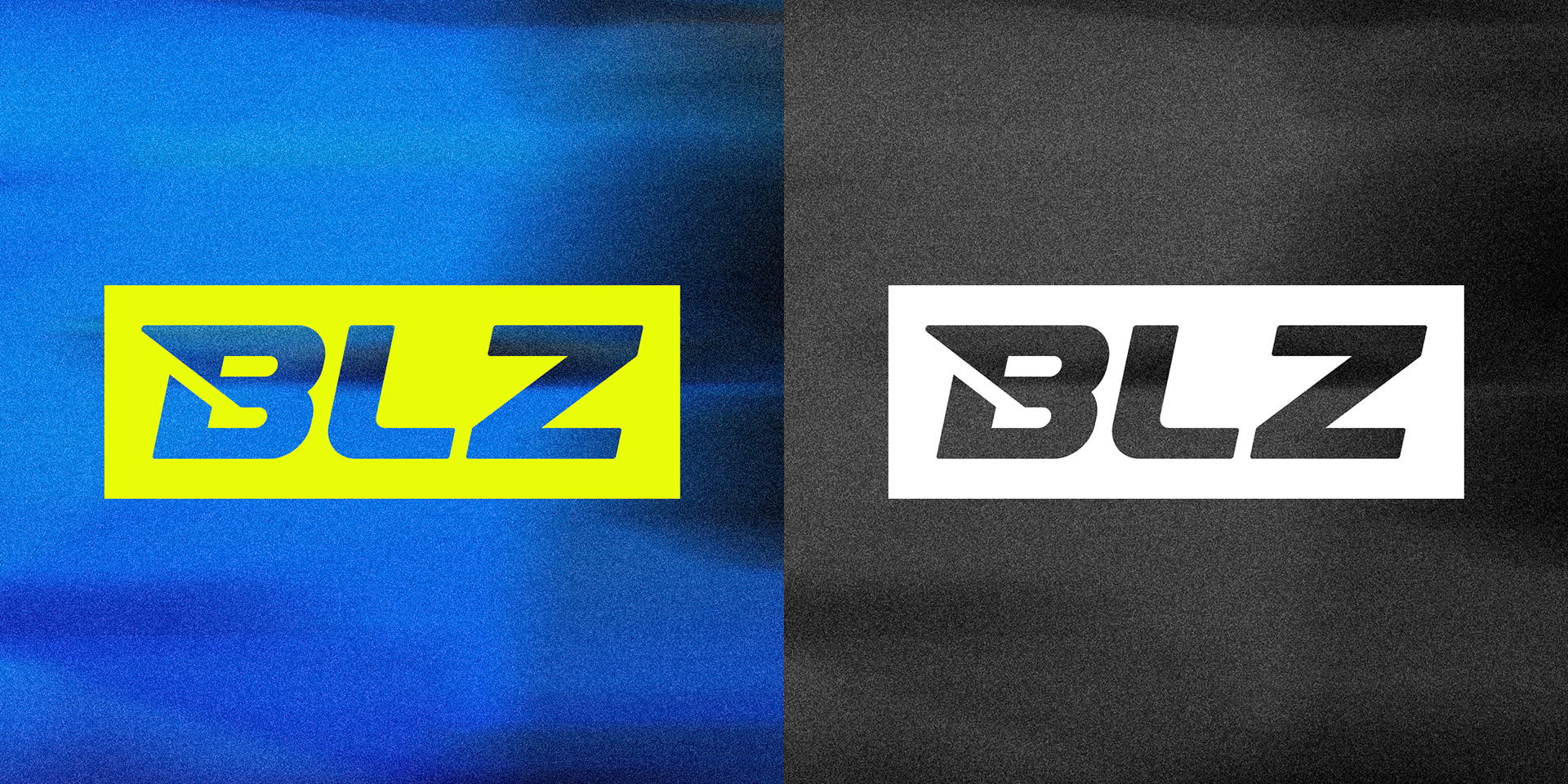
The final logo combines sharp geometric forms with forward-leaning angles to create a sense of speed and momentum. A custom monogram was developed alongside the primary wordmark, giving the brand a versatile system that can be used across everything from social media avatars and merchandise to court-side branding and product applications.
A high-contrast colour palette of electric yellow, deep blue and monochrome tones reinforces the energetic personality of the brand, helping BLZ stand out in a crowded sporting market while maintaining a premium, performance-focused feel.


RACKET DESIGN
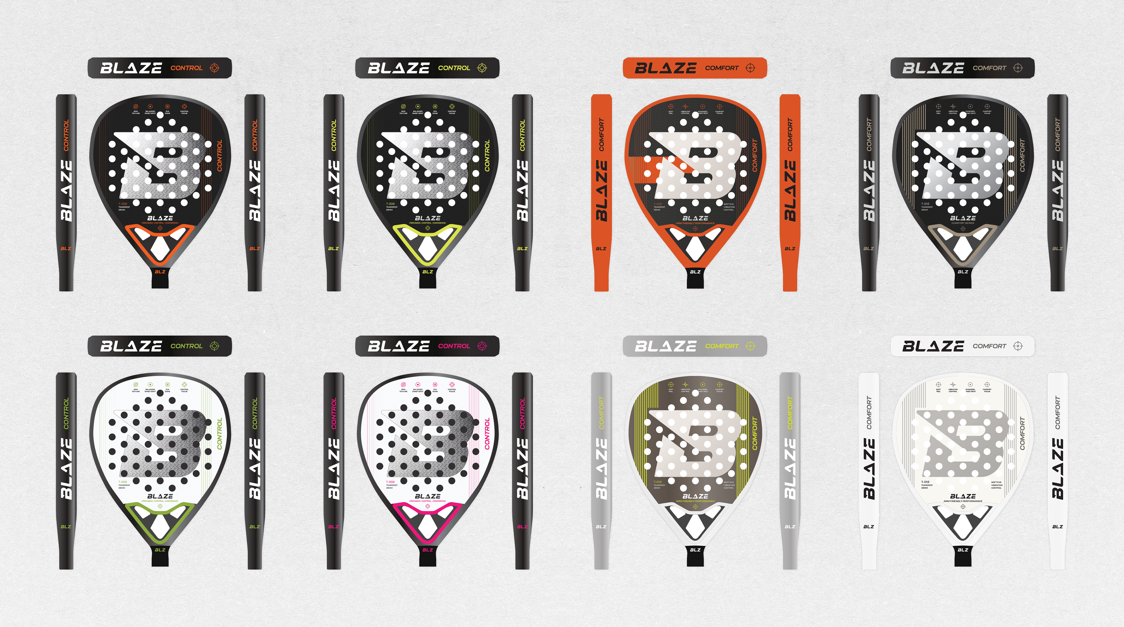
To extend the identity beyond the logo, I designed a series of custom BLZ Padel racket concepts that translated the brand's visual language directly onto the product itself.
Using the signature colour palette, angular graphics and bold typography, the rackets were created to feel like a natural extension of the brand rather than simply carrying a logo. The designs balance performance aesthetics with strong shelf appeal, ensuring they stand out both in play and in retail environments.
The result is a cohesive product range that reinforces the BLZ identity at every touchpoint, helping establish the brand as a modern and ambitious presence within the padel market.